TD Bank EasyWeb: Full-Scale UI/UX Overhaul
This case study focuses on the modernization of TD Bank's EasyWeb app, Canada's second most widely used online banking platform for daily transactions, investments, and account management. It emphasizes improving the credit card user journey, which included creating a new UI that adheres to both current design standards and the updated TD design system.

Date
January 2024
Role
UX Designer / Visual Designer
Company
TD Bank Group
Problem
EasyWeb faced several challenges:
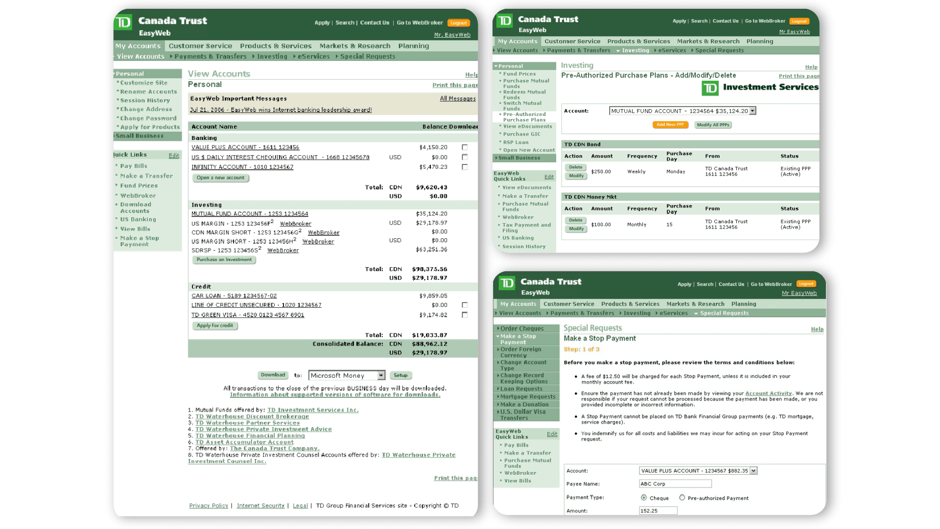
Inconsistent Brand Identity: The app had been inconsistent with the updated TD branding.
Low Usability and Accessibility: While modern consumers, especially younger demographics, expect seamless, intuitive digital experiences, the existing designs do not meet current design standards in terms of accessibility and is not responsive.
Rigid Structure: In a competitive market, EasyWeb needs to be able to adapt to future trends and technological advancements without needing a complete overhaul in the near future.
Goals
We established clear and realistic OKRs to ensure our work remained user-centered, measurable, and aligned with strategic business goals throughout the redesign process.
Objective 1: Improve the overall user experience of the EasyWeb platform
KR1: Increase user satisfaction scores
KR2: Reduce average user task completion time by 25% for key journeys
Objective 2: Align EasyWeb with TD’s updated design system and accessibility standards
KR1: Achieve 100% design system compliance across all redesigned UI components
KR2: Reach WCAG 2.1 AA accessibility compliance across the platform
KR3: Reduce design inconsistencies brought up by internal design audits
Objective 3: Drive adoption and awareness of the updated EasyWeb experience
KR1: Reach 80% user adoption of the new UI within 3 months of rollout
KR2: Achieve 90% completion rate on in-app guided tours and onboarding flows
KR3: Launch internal and external communication campaigns with at least 1M impressions
Next Steps
As a high-impact and high-traffic flow, optimizing the credit cards journey was broken down into manageable tasks:
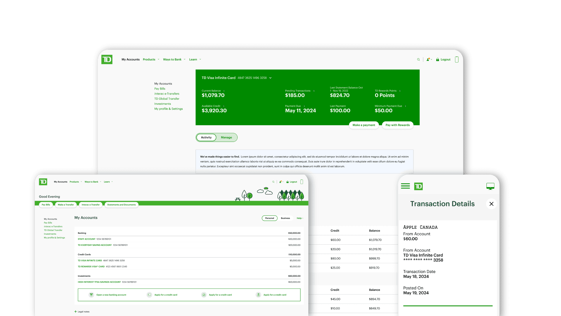
Redesign the Credit Card Dashboard & Details Page
Refine the layout, enhance visual hierarchy, and make key actions such as payments and statement access more intuitive and accessible.Streamline the Payment Flow
Reduce friction by minimizing steps, enhancing form usability, and providing real-time feedback.Improve Mobile Responsiveness
Ensure the experience is fully optimized for mobile, addressing a major user complaint.Implement & Test New Components
Begin integrating updated TD design system components into credit card features and conduct usability testing.

Results
Following the redesign and rollout, we observed strong measurable improvements:
28% increase in task success rate for actions like making payments and viewing statements
35% reduction in average task completion time, thanks to a simplified layout and clearer call-to-actions
40% drop in user-reported issues related to navigation and mobile performance.
98% adoption rate of the new UI within 3 months, with positive feedback on clarity and ease of use
Full compliance with WCAG 2.1 AA standards, improving accessibility for all users
The modern and cohesive modernization project positioned TD Bank as a leader in innovative trustworthy banking.